Tuesday, November 26, 2013
Thursday, November 7, 2013
Tuesday, October 29, 2013
Wednesday, October 23, 2013
Monday, October 21, 2013
Thursday, October 17, 2013
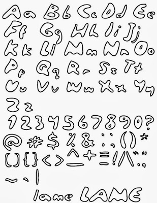
Self-Evalutaion/Title of my Font
- How does your font create a mood, feeling, or image?
It feels like a sort of lazy teenager print, just really messy but readable. - How does this font represent you?
I write like this after a long time, when I give up on it being easy to read. - Where could your font be used? What sort of document? What will it say? What audience?
This font could be used as a video font, a banner, and it would mainly be for a teenage audience. - Title your font in a descriptive way, what would you call it?
I titled it Lame, because that's what I think it is.
Monday, October 7, 2013
Monday, September 30, 2013
Monday, September 23, 2013
Monday, September 9, 2013
Saturday, September 7, 2013
Elements of Design
Colour: vividness, authenticity, or individuality expressed through a shade or a hue
|
| Shape: the outline of something's form |
| Form: the shape or structure of a thing that gives it its distinctive character |
| Texture: the feel and appearance of a surface |
Subscribe to:
Comments (Atom)


